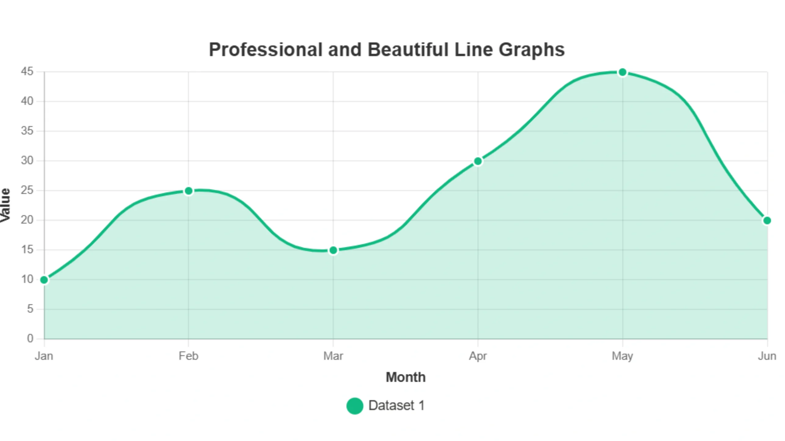
A line graph is a chart that shows how values change over time. It connects data points with straight lines, helping you see trends—whether something is increasing, decreasing, or staying the same. You might also hear it called a line chart or line plot.
Line graphs are important because they make data easier to understand at a glance. Whether you’re tracking business growth, health progress, or scientific results, a line graph can help you spot patterns you might miss in raw numbers.
This guide will explain what a line graph is, why it’s useful, the types you might see, where people use them, and how you can make one yourself.
What is a Line Graph? The Core Concept
Let’s take a closer look at what a line graph truly shows. At its base, it’s a way to visually map data points on a grid.
This grid is known as a two-dimensional plane. Locations on it use two values. Think of it like a map with a horizontal path (east-west) and a vertical path (north-south).
On a line graph:
- The horizontal axis (usually the X-axis) acts like the ‘east-west’ path. It typically represents the independent variable. This is often something that moves forward steadily, such as units of time (like days, months, or years) or items in a specific order.
- The vertical axis (usually the Y-axis) acts like the ‘north-south’ path. It represents the dependent variable. This is the quantity you measure. Its value might change based on the independent variable, like temperature, sales amount, or speed.
You put your data points on a grid where the X and Y values meet. Then, you connect the points in order using straight lines. This line shows how the values change. You can easily see if the numbers go up, down, or stay the same by looking at the line’s direction and steepness.
The Important Parts of a Line Graph
Every line graph has several key components that work together to present information.
Knowing these parts helps you understand exactly what the chart shows.
Here are the key parts:
- Chart Title: This is the main heading at the top of the graph. It tells you right away what data appears. A good title is like a clear headline.
- Axes (X-axis and Y-axis): These are the two main lines that form the graph’s frame. They provide the structure and scale for plotting your data points.
- The X-axis runs horizontally (left to right), usually at the bottom. It often shows the independent variable (like time).
- The Y-axis runs vertically (up and down), usually on the left side. It shows the dependent variable (the measured value).
- Axis Labels: These are words written next to the X and Y axes. They name exactly what each axis represents. They include the units of measurement if needed (like “Months,” “Revenue ($)”, or “Temperature (°C)”).
- Scale: The scale defines the range of values shown on each axis. It shows how those values space out. It sets the minimum and maximum numbers displayed. It sets the intervals between the marks.
- Data Points: These are the dots or markers you plot on the graph. Each data point represents one specific pair of values from your data (an X value and a Y value).
- Lines: These are the straight segments that connect the data points in order. They form the continuous path. This path shows you the trend and movement of the data.
Sometimes, you might see bars used alongside lines. But these six elements are basic for any standard line graph.
Different Kinds of Line Graphs
Line graphs can take slightly different forms depending on the data you show and on how you want to compare it.
Understanding these types helps you choose the right one for your needs.
Here are different kinds of line graphs:
- Simple Line Graph: This is the most basic type. It uses just one line. It shows the trend of a single set of data over time or across ordered categories.
- Multiple Line Graph: This graph shows and compares the trends of two or more different datasets. They appear on the same chart. Each dataset gets its own line, usually in a different color or style. This helps compare things side-by-side.
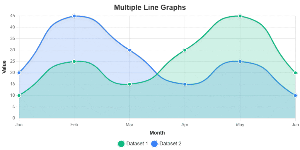
When there are only two lines, it’s often called a double line graph. With three lines, it’s a triple line graph.
- Compound Line Graph: This type is less common. It is useful for showing how different parts add up to a total over time. The lines represent the cumulative sums. The space between the lines shows each individual part’s value that contributes to the total.
- Straight Line Graph (or Linear Graph): This describes the shape the line takes. It is not a different chart structure. If the data shows a constant rate of change – meaning the Y value goes up or down by the same amount for each equal step along the X-axis – the resulting plot will be a perfectly straight line. This indicates a linear relationship between the variables.
- Vertical and Horizontal Lines: Sometimes, a graph might include a simple vertical or horizontal line.
- A vertical line runs straight up and down at a single point on the X-axis (meaning the X value is fixed).
- A horizontal line runs straight across at a single point on the Y-axis (meaning the Y value is fixed).
These do not typically show data trends that change over time. But they can be useful as reference points. They can mark specific events. They can show fixed targets or boundaries on a chart.
What Line Graphs Are Used For: Seeing Data in Action
Here are some of their most common and important uses:
- Showing Trends Over Time: This is what line graphs do best. They clearly show if something is going up, going down, staying the same, or changing up and down across a period. This applies to tracking stock prices over a day, website visitors over a month, or average temperatures over a century.
- Comparing Different Things: Using a multiple-line graph lets you show trends for two or more different items or groups on the same chart. This makes it easy to visually compare how they performed or changed over the same time period. For example, comparing sales trends of two competing products or growth in different geographic regions.
- Identifying Patterns: The shape of the line quickly shows patterns in your data. You can see if there’s a repeating pattern every week or season (e.g., more social media activity on weekends). You can see if specific events caused a sudden change.
- Showing Rate of Change: The steepness of the line directly shows you how fast something changes. A line that goes sharply up means a rapid increase. A line that slopes gently indicates a slower change.
- Visualizing Continuous Data: For data that flows continuously (like temperature or speed), the connected line on a line graph feels natural. It accurately shows the smooth progression from one measurement to the next.
You can find line graphs used widely in many different fields:
- Business: Tracking sales figures, market share, website traffic, and financial performance over time.
- Science: Charting experimental results, monitoring environmental changes, or showing population growth.
- Finance: Visualizing stock prices, cryptocurrency values, or economic indicators like inflation.
- Weather: Displaying temperature highs and lows, rainfall, or wind speed over days or months.
- Health: Monitoring patient recovery data, tracking health metrics, or showing disease trends.
How to Make a Line Graph Today: Simple Steps
Creating a line graph means taking your organized data and turning it into a visual chart. The way you do this can vary.
You can draw by hand or use digital tools. Regardless of the method, the basic steps are generally similar.
Here are the simple steps:
- Organize and Prepare Your Data: You need your data ready. Easily identify the values for your X-axis (like dates or categories) and values for your Y-axis (the measurements).
- Choose Your Method or Tool: Decide how you will create the graph. Common ways include:
- Drawing by hand: Use graph paper. Plot points manually. Draw lines. This is useful for small datasets or learning the basics.
- Using Spreadsheet Software: Programs like Microsoft Excel or Google Sheets have charting features. They can automatically create graphs from data entered into cells.
- Using Specialized Graphing Software: More software exists specifically for data visualization. It offers extensive customization. It often costs money and requires installation.
- Using an Online Line Graph Generator: Web-based tools specifically create line graphs quickly. They work easily in your internet browser, often for free.
- Input Your Data: Get your organized data into your chosen tool or onto your graph paper. Digital tools usually make this easy. Options let you type data. You can copy and paste from spreadsheets. You can upload files like CSVs.
- Configure Graph Elements: Set up your axes. Define the range of values on your scale.
- Add Labels and Title: Clearly label your X and Y axes. Give your graph a descriptive title.
- Generate or Draw: Let the digital tool automatically create the graph based on your input.
- Refine and Export: Make any final visual adjustments (like colors or line styles). Then save your digital graph (often as an image file like a PNG). Or prepare your hand-drawn graph for use.
Using an online line graph generator often makes steps 3 through 6 much faster. It is more precise than manual methods. You can create professional-looking graphs with greater ease.
Choosing the Right Data for a Line Graph
Not all data works best shown with a line graph. Line graphs are particularly good for certain types of information.
Data that works best usually has two main characteristics:
- Ordered or Continuous on the X-axis: The data you put on the horizontal axis (the X-axis) should have a natural order or flow. The most common example is time (like dates, months, or years). It progresses in a clear sequence. Other ordered categories or steps in a process also work well.
- Continuous Numerical Values on the Y-axis: The data you put on the vertical axis (the Y-axis) should be numerical. It should take on any value within a range (like temperature, height, or price, which can have decimal points). This is the value being measured or tracked. Its value changes as the X-axis changes.
In a line graph, the X-axis usually shows the independent variable—it changes on its own. The Y-axis shows the dependent variable—it changes based on the X value.
If your data compares items without a clear order on the X-axis, or if the Y values are separate categories, a line graph may not work well. In that case, a bar graph is often a better choice.
Line Graphs Vs Other Chart Types
Line graphs are powerful, but they aren’t the only way to visualize data. Different types of charts are better suited for different kinds of information.
Here is how line graphs compare to some other charts:
Line Graphs vs. Bar Graphs:
This is a common comparison.
| Feature | Line Graphs | Bar Graphs |
| Primary Use | Show trends or changes over time. | Compare discrete categories. |
| Data Emphasis | Connection and flow between points. | Individual values in separate groups. |
| X-axis Data | Often continuous or ordered (like time). | Distinct categories. |
| Y-axis Data | Numerical values. | Numerical values. |
| Best For | How something evolves over time. | Comparing “how much” in different groups. |
Line Graphs vs. Scatter Plots:
Scatter plots show individual data points on an XY grid. This is similar to the first step of a line graph. However, points are not connected by lines in a standard scatter plot.
Scatter plots show the relationship or correlation between two variables. They do not necessarily show a sequence or trend over time. Line graphs add a sequential connection to show the path or trend.
Line Graphs vs. Area Graphs:
An area graph is very similar to a line graph. The area below the line is filled in with color or shading. This can sometimes make the size of the values more noticeable.
But it can also make it harder to compare multiple datasets if areas overlap awkwardly.
Why Use a Free Online Line Graph Generator? The Easy Way to Visualize Data
You can create line graphs using spreadsheets or other software. But using a dedicated online line graph generator has become a popular choice.
Here are the benefits of using our free online line graph maker:
- It’s Free: Our tool lets you create professional line graphs without costing you anything.
- No Installation Needed: You can access the tool and start creating graphs directly in your web browser. This works on any device with internet access.
- Quick and Easy: This built for speed and simplicity. You can often turn your raw data into a finished graph in moments. This is usually done by typing, copying and pasting, or uploading a file.
- User-Friendly Interface: Compared to menus in spreadsheet software, our tool has clear, simple interfaces. They are designed specifically for graph creation.
- Professional-Looking Results: This tool can help you create clean, clear, professional graphs. These are perfect for presentations, reports, or sharing online.
- Easy Customisation: Easily change the visual aspects of your graph. Adjust colors, line styles (like solid, dashed, or dotted), point shapes, fonts, axes settings, and grid lines.
- Handle Multiple Lines with Ease: Quickly add and manage several datasets on one chart. This makes it simple to create multiple line graphs for direct comparison.
- Simple Data Input: Copying and pasting from spreadsheets works easily. Quick CSV file uploads are possible.
- High-Quality Download: Save your finished graph as a crisp, clear image file (like a PNG). It’s ready to use in documents, presentations, or on the web.
Create Your Free Line Graph Now
Conclusion: Visualize Your Data with Ease
Line graphs are very valuable tools for understanding data. This is especially true when you want to see how things change over time. They provide a clear picture fast.
This helps you spot trends. It helps you make comparisons between different datasets. It helps you easily share your insights with others. This applies to any area of study or work.
Our Free Online Line Graph Generator is designed with simplicity and speed in mind. It costs nothing.
You do not need to sign up. It has an easy-to-use interface. You can quickly turn your raw data into clear, professional, and informative line graphs in just moments.
Create Your Free Line Graph Instantly
Frequently Asked Questions About Line Graphs
Q1: What is a line graph’s main use?
A1: A line graph primarily shows how a value changes over a continuous period, most often time. It’s the best chart type for easily spotting trends and patterns in your data as it changes.
Q2: When should I pick a line graph instead of a bar graph?
A2: You should use a line graph when your data represents a continuous change (like measurements over time). You want to focus on the trend and connection between points. Use a bar graph when you need to compare distinct, separate items or categories at a specific point.
Q3: Can a line graph show more than one set of data at once?
A3: Yes! This is called a multiple line graph. It is a very effective way to plot and compare the trends of two or more different datasets over the same period on a single chart.
Q4: What kind of data works best for creating line graphs?
A4: Line graphs are good for data where the horizontal axis represents ordered categories or a continuous flow (like time). The vertical axis represents numerical values that change along that order. Time-series data is a classic example.
Q5: What do the X and Y axes show on a line graph?
A5: The X-axis (horizontal) typically represents the independent variable, which is often time or a sequence. The Y-axis (vertical) represents the dependent variable, the numerical value being measured that changes based on the X-axis.
Q6: Is a “straight line graph” a different type of chart?
A6: No, a straight line graph is not a different chart type. It describes the shape the line takes. A straight line shows a linear relationship where the rate of change between the X and Y values is constant. [Link to Can a Line Graph Have a Straight Line? Understanding Linear Relationships]
Q7: What essential parts should I look for in a line graph?
A7: The key parts are the Chart Title, the X and Y Axes, the Axis Labels (explaining what the axes measure), the Scale (how the numbers are arranged), the Data Points (the plotted values), and the Lines connecting those points.
Q8: Do I need special software to make a line graph?
A8: No, you do not. While software like Excel can create them, many user-friendly free online line graph generators exist. They let you easily create and customize line graphs directly in your web browser.